


What I learnt from doing my own colour analysis

A recent reorder of the knitwear shelf in my wardrobe revealed a decided lack of colour within my sweater collection. By colour, I mean anything other than grey, beige, brown, cream, black or navy. As I added yet another brown toned knit to my wardrobe this week (100% cashmere from my local charity shop, what can I say), I thought it best to hide it from husband, knowing what he’d say about the level of same-sameness (sorry love, if you’re reading!).
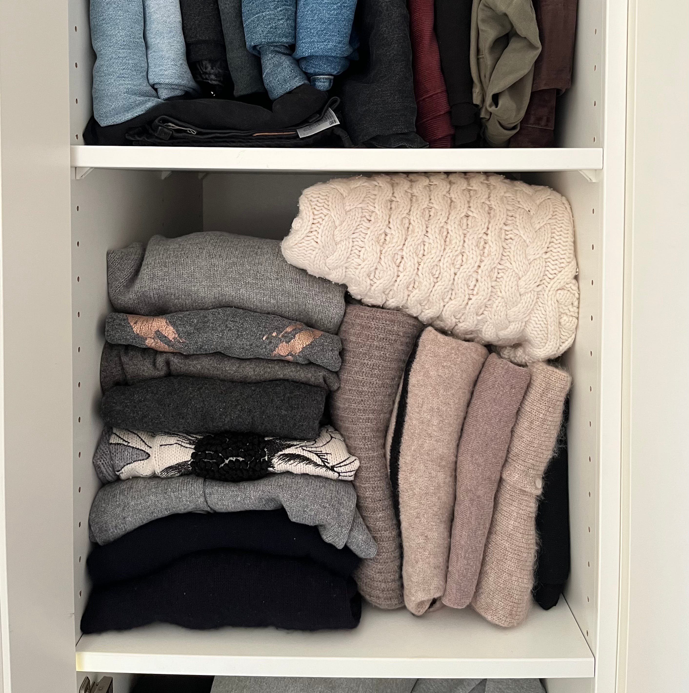
While this may be some people’s idea of minimal muted heaven, I’m craving an injection of colour and I’m feeling inspired by the quiet frenzy of soft tones below.

The reason I’ve held off investing in new or preloved knitwear with colour is that I don’t feel 100% confident in what tones work best for me. Having had her colours done ‘professionally’,
created a super useful and informative video, and a subsequent Substack post on how this exercise ‘has lessened the shopping noise’. You know my love of a sustainable style practice and this is a great one!
While I await the time/ budget/ courage to seek professional help, I thought I’d take a first look myself, explore colour science and undertake a DIY seasonal colour analysis. For stylists, there will be no news headlines here, but for those of us on a style learning curve, hopefully there is something here that will help you to identify the tones of colours that suit you in the best, and maybe even your hero colour.
Seasonal analysis
I use the term tones of colours, as technically there should be no colours which are out of bounds - all colours should be on the table, just not all tones of that colour. There will be, of course, colours which you will exclude from a personal preference. It’s often these preferences to which we have already gravitated that are likely to be where our seasonal analysis and colouring sits best.
So let’s get our definitions correct to start with:
Hue simply refers to a colour’s name or identity, i.e. red, green, brown.
Tone refers to the saturation, and lightness or darkness of a colour or hue.
Colour analysis is the science based on colour theory which associates people with ‘seasons’, each season comprising a palette of tones that best compliments our natural colouring. Colours are categorised into warm yellow-based tones or cool blue-based tones.
Spring tones tend to be warm and bright, i.e. apple green, coral, turquoise.
Summer tones tend to be cool and light, i.e. sea blue, lilac, cosy red.
Autumn tones tend to be warm and dark, much like the season itself, i.e. rusty orange, brown, bottle green).
Winter tones tend to be cool and dark, i.e. icy white, black, dark blue, ruby red.
Being a natural redhead (yes!) with a pale Irish complexion, there’s no doubt that I’m a cool Celt, so I’m focusing my analysis on Summer and Winter tones, and on the lighter, softer hues. Sorry Spring/ Autumn girls! If you’re interested in exploring your own colour analysis, there’s some great online material here and here. I’m also focusing on pink/ purple-ish tones for the sake of brevity and because these are colours which I’d like to refine in terms of what suits me and to know what to add to my wardrobe.


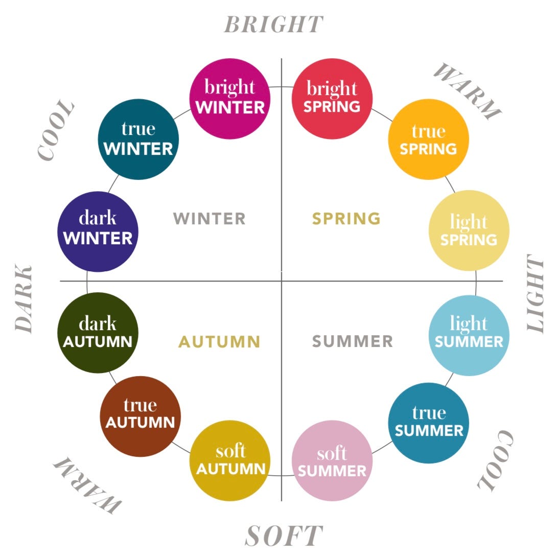
Just as the seasons don’t change overnight, there are also transitional periods or sub-seasons to consider. These sub-season tones are defined by saturation (or chroma), and by lightness or darkness (see below from True Colours Studio).
To help me in my DIY analysis, I bought a digital drape template from Etsy, which handily downloads and transfers into the Canva app. All I had to do was add an unflattering photo of myself with no makeup and in the glare of natural light 😆. Way to make you feel old!
Being of cool colouring, I knew to start my analysis somewhere between sun-seasons true or dark winter, and light, true or soft summer. Here’s what I learnt:
DIY seasonal colour analysis is harder than I thought! Without a helpful (and honest) friend or partner to bounce these images off, it’s tricky to know if you are drawn to a tone because it suits you or simply because you like it as a colour.
It is likely that there will be tones within your chosen sub-season set which don’t work for you, and tones within each sub-season which do. Confusing, huh?
You may end up straddling two sub-seasons, interchanging between the two depending on your seasonal skin changes and your mood.
With a lick of fake tan or a bit more blush on cool colouring for example, you may be able to venture into wearing those warmer Autumnal tones.
For me, I think that the TRUE SUMMER sub-season set of tones best compliments my natural colouring, and, him-indoors agrees. This sub-season is characterised by very cool and toned down shades of colours.
While far from conclusive, this outcome did surprise me - I’m naturally more drawn to the extremely muted tones of SOFT SUMMER or the icy pastels of TRUE WINTER - which makes me think that maybe there is merit in trying DIY seasonal colour analysis.
Using the digital drape template was a quick, easy and reasonable way to gain some insight into my ‘true colours’ (cue Cyndi Lauper). It has pointed me in the direction of slightly stronger tones than I would naturally think of, and it was fun! However, I will still be seeking the help of a professional in time.


Hero colour
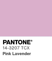
So, is there a clear hero colour from this sub-set of my home colour analysis? A front runner would have to be the ‘Pink Lavender’ tone from the TRUE SUMMER set. I like it and the blue undertones of this shade work with and lift my cool colouring. It’s cute too.
What’s next
Buoyant with this knowledge, I set forth online to find my perfect colour match. However, this also proved tricky! You can never be quite sure of the tone of an item until you see it in the flesh, and this ‘Pink Lavender’ tone is so specific that a simple filter search under ‘pink’ is not all that revealing. Reverting to ye olde IRL shopping, I ducked into The Hambledon store in Winchester this morning - a great store with some top brands. Here’s what I tried on from the brand Bellerose. Which one do you think works better for me?


While I continue to dither, I’ve gathered some seriously inspiring pink-toned knitwear for your delectation, including more from Dries Van Noten - my latest aspirational brand crush. Preloved searches have been set, with some great pieces noted here and here.

Although not completely conclusive, what this exercise in home colour analysis has given me is an increased knowledge of what tones best suit my colouring and more confidence to seek these out IRL. How have you reached your colour destination? Hope to see you in the chat and next weekend, Jenny x
Colour analysis is such a fun tool, but in general I would say wear what you like and feel good in. I think it can be worth investing in a colour analysis if it's something you're interested in (but I haven't tried it myself). The thing with using a digital version is that different screens show colours differently, so my guess is that it can be hard to tell which is best. In your pics with the sweater the spring looks better, but that may very well be due to the lighting and it just pops more in the photo. Looking forward to following your journey into colour!
That pink sherbet jumper looks INCREDIBLE on you 😍